
Project
Nexa
Introduction
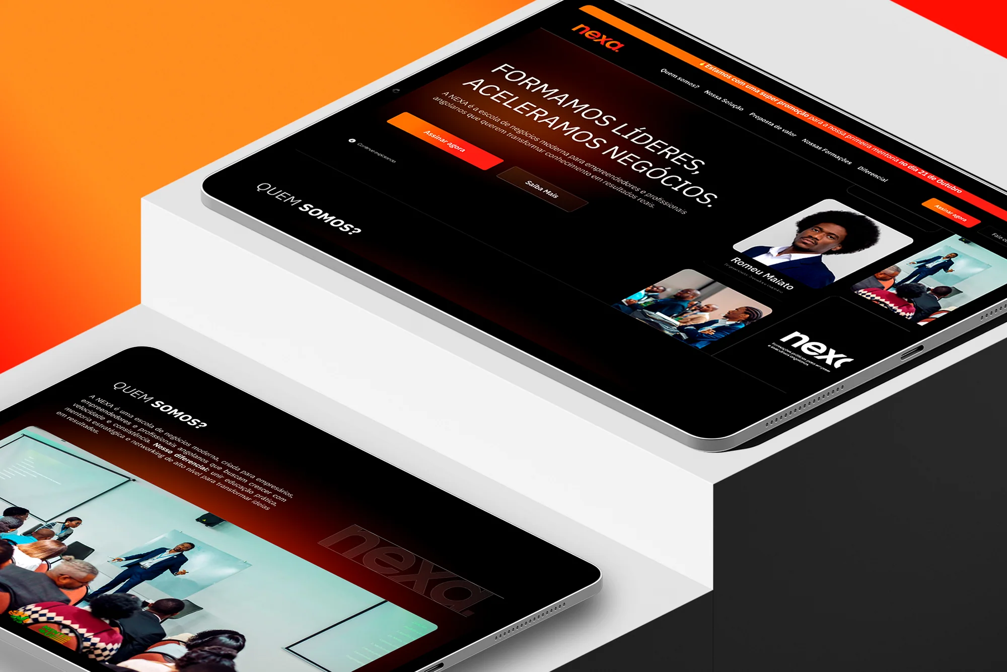
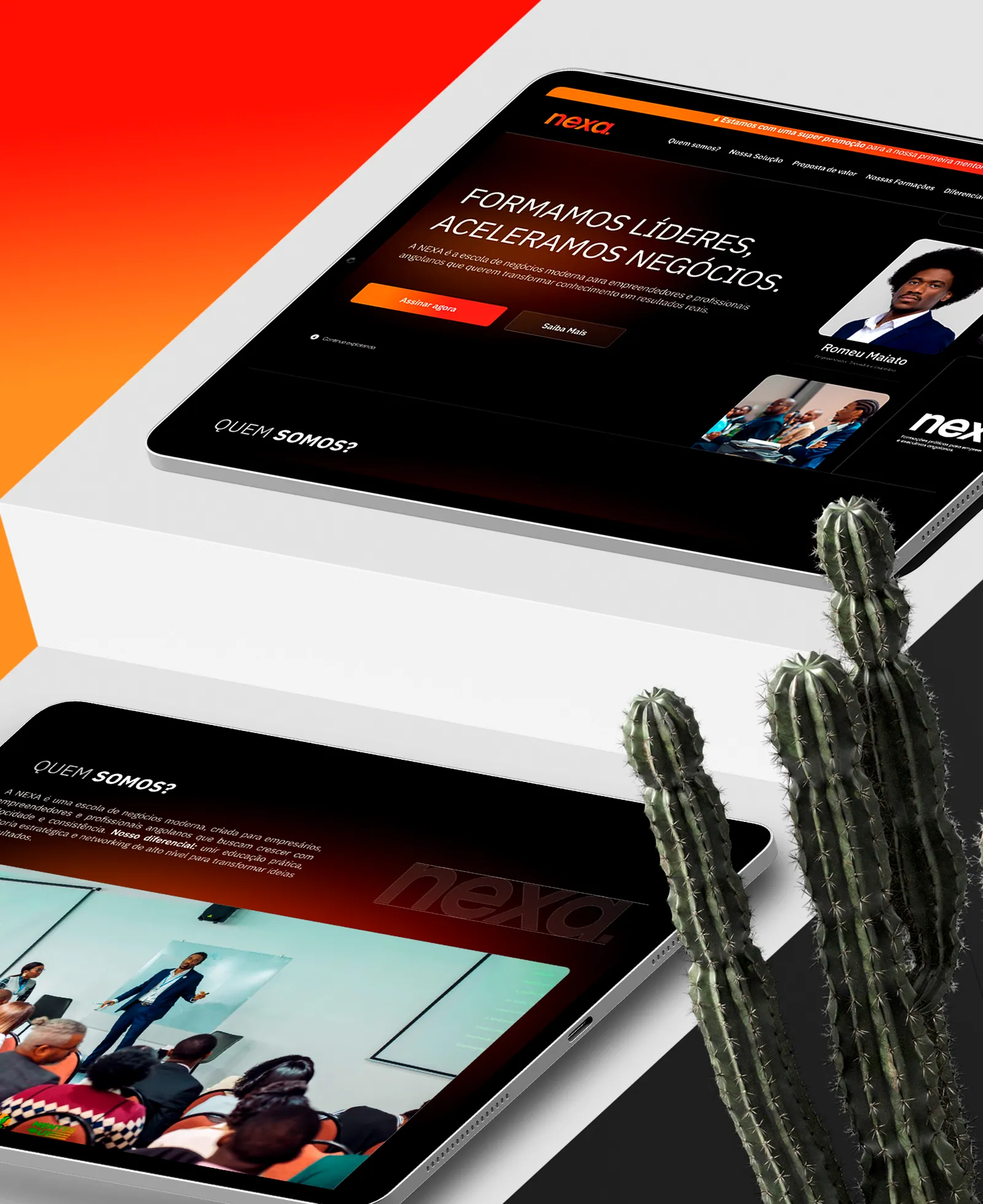
Nexa trains leaders and accelerates businesses. We designed its digital presence to present who teaches, what is learned and the products, in a dark environment with orange energy.
- Year
- 2025
- Industry
- Training
- Leadership
- Service
- Website
- UX/UI
- Solution
- Website
- Platform
- Web
- Tablet
- Mobile
The scenario
Training leaders starts with showing who trains them.
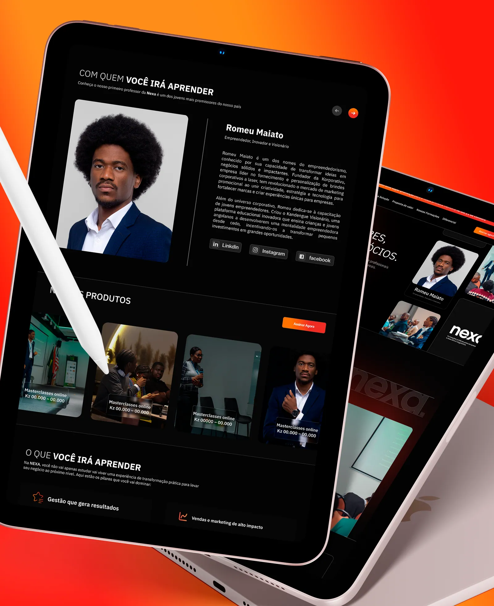
Nexa's offer depends on trust in the people who teach. The website puts the instructor, what you will learn and the products at the centre, with a direct line right at the start: we train leaders, we accelerate businesses.
Typography and colour
The project's visual language.
Typography and palette set the tone of every screen: a readable family and a short palette, with supporting tones for states and surfaces.
Inter
A sans serif designed for digital interfaces, with strong on-screen legibility and a wide range of weights.
Primary
Nexa Orange
HEX#FF891B
Secondary
Vivid Red
HEX#FF1E0B
Neutral
Black
HEX#030303
Neutral
Light Grey
HEX#E2E2E2
Challenges
Say the essential, straight away.
- 01Say what Nexa does in a single sentence, right at the start.
- 02Give the instructor's profile the spotlight.
- 03Present the products and what you will learn clearly.
- 04Create a dark, energetic environment that fits the brand.
- 05Keep the experience consistent from tablet to phone.
Results
A presence with personality and authority.
Dark contrast, the brand's orange and the instructors up front: the website conveys authority without losing warmth, and makes clear from the first screen what Nexa offers.
Keep exploring
More projects

Have a similar project?
Tell us the context. We help turn the need into a clear, buildable solution.
Talk to us