
Project
Okuenda Tour
Introduction
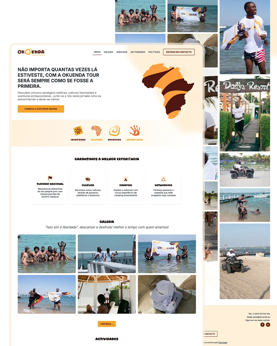
Okuenda Tour organises tourism and experiences in Angola. We created the visual identity and the website to convey the energy of people who have been there and invite those who have not.
- Year
- 2025
- Industry
- Tourism
- Experiences
- Service
- Website
- Visual identity
- UX/UI
- Solution
- Website
- Platform
- Web
- Mobile
The scenario
Selling an experience that can only be understood by living it.
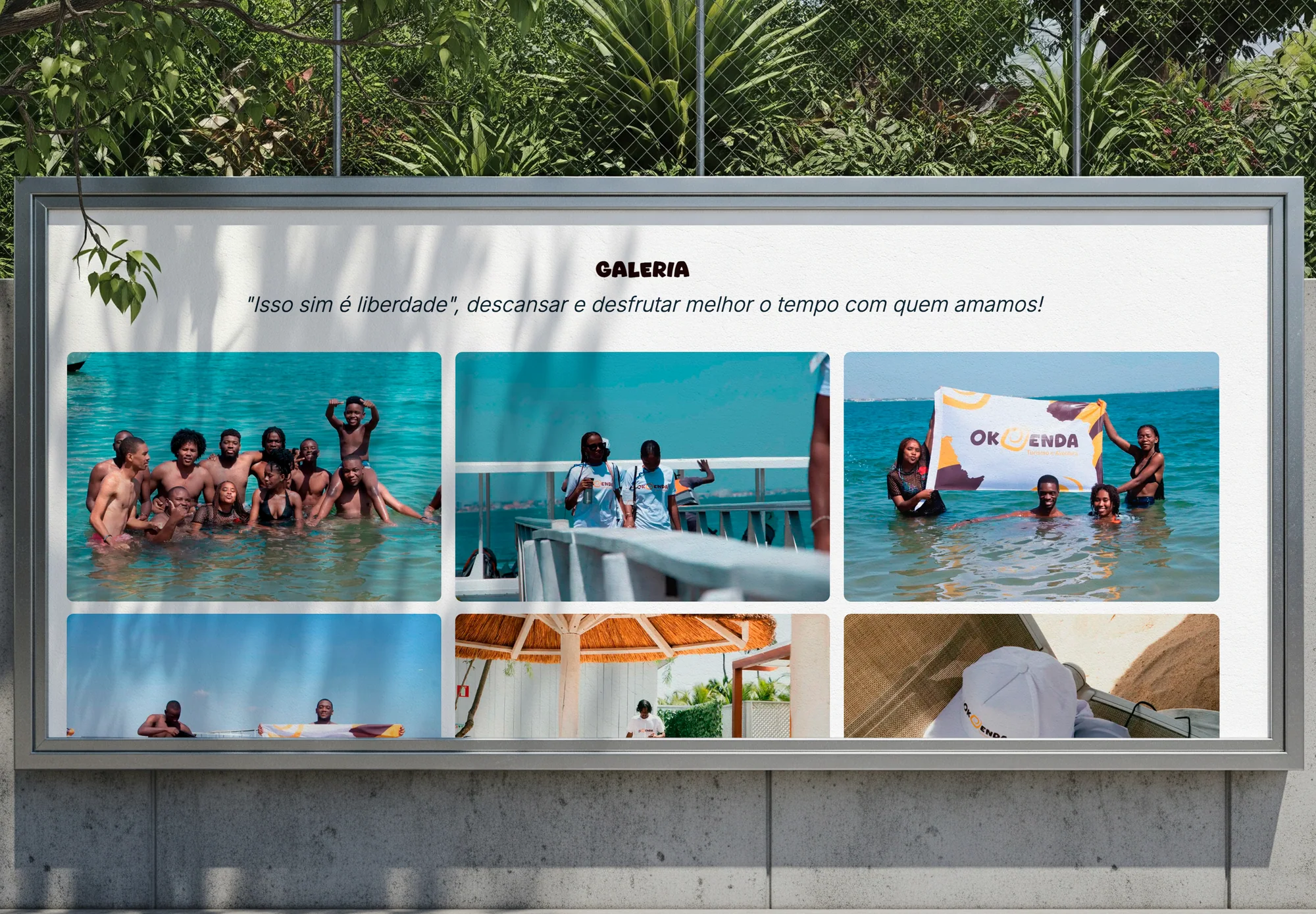
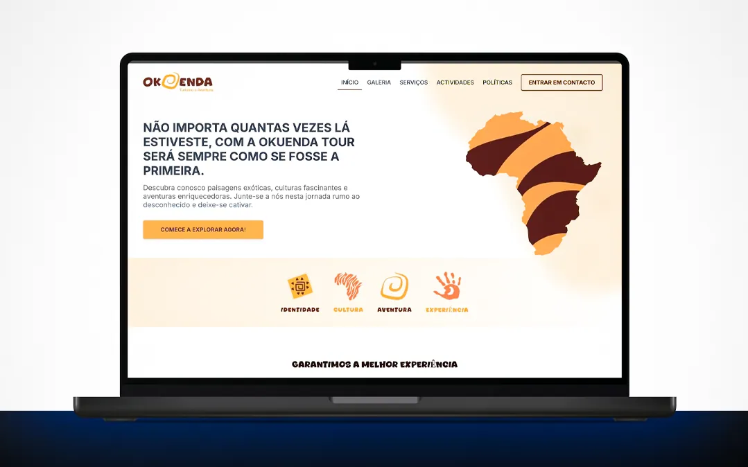
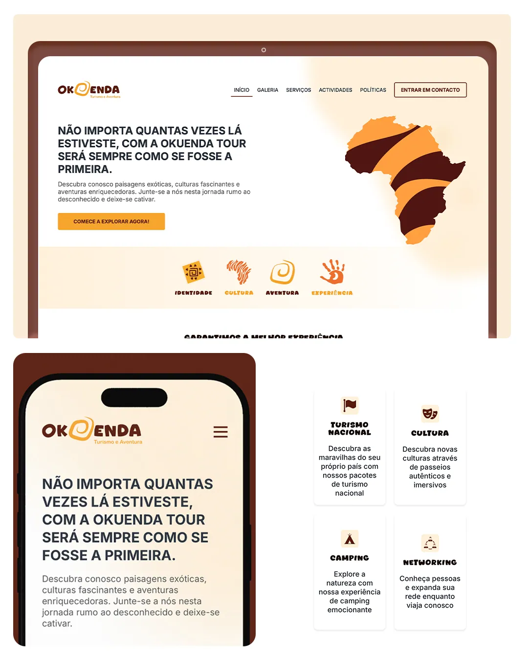
Tourism is sold with image and emotion. The website puts travel photography and the brand's promise — that every trip feels like the first — up front, with clear categories for national tourism, culture, camping and networking.
Typography and colour
The project's visual language.
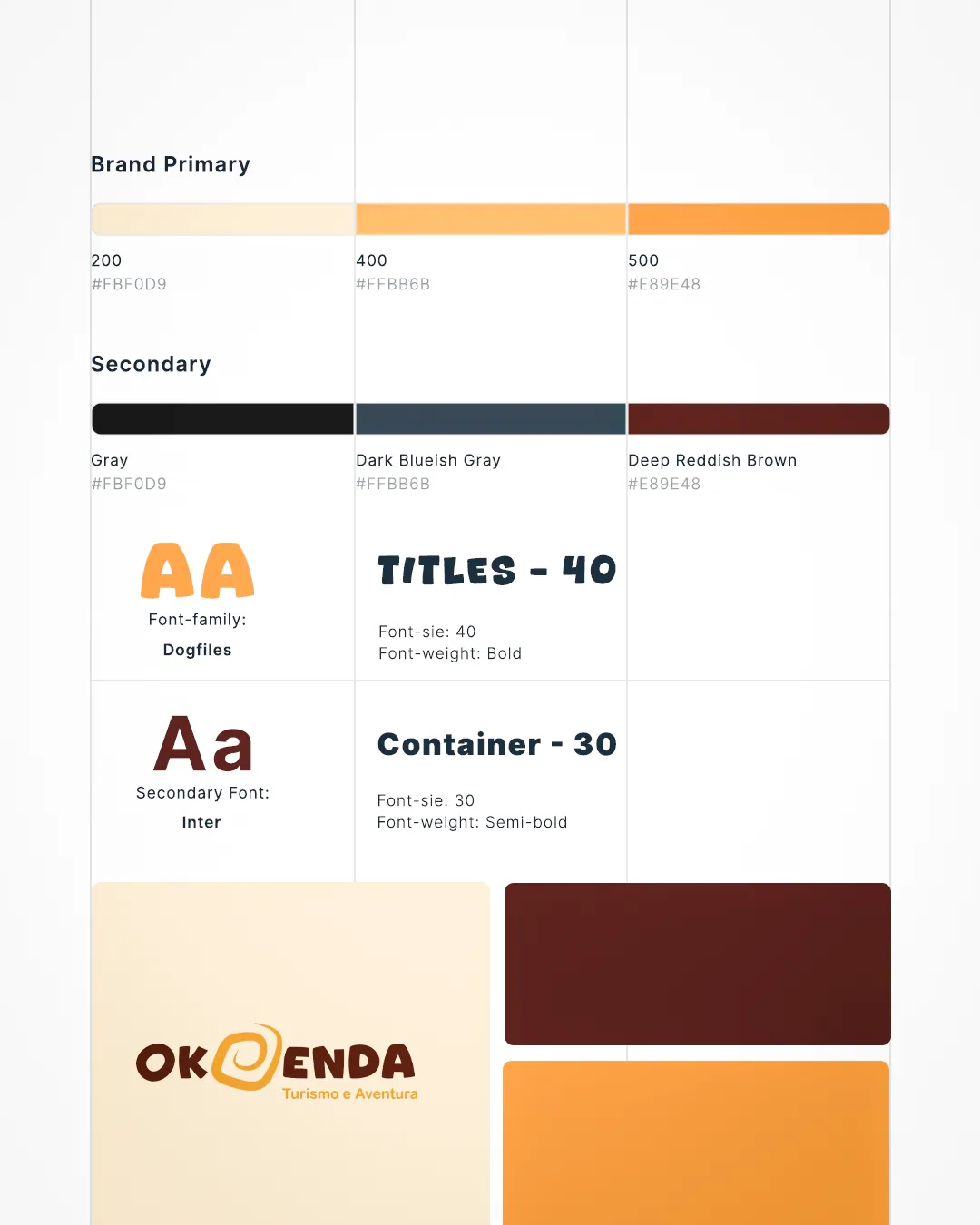
Typography and palette set the tone of every screen: a readable family and a short palette, with supporting tones for states and surfaces.
Inter
A sans serif designed for digital interfaces, with strong on-screen legibility and a wide range of weights.
Primary
Okuenda Orange
HEX#F6A42A
Primary
Deep Brown
HEX#4F1811
Secondary
Terracotta
HEX#77473C
Neutral
Cream
HEX#FBECD8
Challenges
A brand with warmth, a website with clarity.
- 01Create a distinct visual identity, with defined colours and typography.
- 02Turn the brand's promise into words and image right at the start.
- 03Organise national tourism, culture, camping and networking.
- 04Make room for a travel gallery with real photographs.
- 05Deliver the same experience on phone and desktop.
Results
A brand and a website with warmth and colour.
The orange-and-brown identity, the map of Africa as a symbol and the travel gallery give proof of what Okuenda offers, in a simple and welcoming way.
Keep exploring
More projects

Have a similar project?
Tell us the context. We help turn the need into a clear, buildable solution.
Talk to us